



Qu'est-ce qui rend un amigurumi « Kawaii » ?
L'amigurumi kawaii a pris d'assaut le monde du crochet, et si vous avez passé du temps sur Instagram, Pinterest ou Etsy, vous avez presque certainement ressenti son charme. Le mot « kawaii » signifie « mignon » en japonais, mais dans la communauté des créateurs, cela signifie bien plus que cela. C'est une esthétique entière construite autour de la douceur, de la rondeur, de l'innocence et d'un charme irrésistible qui donne envie de serrer la petite créature. Lorsque vous concevez un amigurumi kawaii, vous ne faites pas seulement un jouet ; vous créez un petit concentré de joie qui communique chaleur et bonheur sans dire un mot.
Dans ce guide, nous explorerons les principes de conception qui rendent l'amigurumi kawaii si apprécié, comment créer des palettes de couleurs oniriques et cohérentes, et peut-être le plus important, l'art du placement des yeux qui donne vie à vos personnages. Que vous soyez un crocheteur chevronné cherchant à affiner votre style ou un débutant curieux attiré par la mignonnerie, vous trouverez des conseils pratiques et exploitables que vous pourrez appliquer à votre prochain projet. Nous vous indiquerons également les fournitures qui rendent la magie kawaii possible, car les bons matériaux facilitent vraiment la conception.
Principes de conception d'Amigurumi Kawaii que tout créateur devrait connaître
Un bon design kawaii n'est pas accidentel. Derrière chaque personnage adorable se cachent quelques principes qui, lorsqu'ils sont appliqués ensemble, produisent cette réaction « aww » caractéristique. Décortiquons-les un par un afin que vous puissiez les intégrer à votre propre travail.
Proportions Chibi : Faites grand ou ne faites rien
La base du design kawaii est la proportion « chibi », un terme japonais désignant le style super-déformé où la tête est considérablement plus grande que le corps. Dans l'amigurumi kawaii, un rapport tête/corps d'environ 1:1 ou même plus grand est courant. Cette tête surdimensionnée déclenche notre réponse naturelle à prendre soin, la même que nous ressentons envers les bébés humains, et est instantanément perçue comme mignonne. L'évolution nous a programmés pour protéger les créatures à grosse tête et petit corps, et le design kawaii exploite magnifiquement cet instinct.
Lorsque vous planifiez un personnage kawaii, esquissez-le en faisant de la tête la caractéristique dominante. Un petit corps avec des membres trapus, un ventre rond et une énorme tête sera toujours perçu comme plus mignon qu'une silhouette proportionnée de manière réaliste. Ne combattez pas l'envie de rendre la tête énorme ; embrassez-la. Si vous adaptez un motif animal existant, le moyen le plus rapide de le rendre kawaii est d'agrandir la tête et de rétrécir le corps dans votre prochaine version.
Les silhouettes arrondies l'emportent à chaque fois
Les angles vifs et les formes pointues sont perçus comme « dangereux » ou « sérieux » par notre cerveau, tandis que les formes arrondies et blobby sont perçues comme « sûres » et « amicales ». L'amigurumi kawaii s'appuie fortement sur des silhouettes douces et arrondies : têtes rondes, ventres ronds, bras et jambes ronds et trapus, et courbes douces partout. Même lorsque votre personnage a des oreilles ou des ailes, gardez leurs bords doux et arrondis plutôt que nets et anguleux.
C'est aussi pourquoi l'amigurumi en tant qu'artisanat est si naturellement adapté au kawaii. Le crochet travaillé en rond produit des formes magnifiquement arrondies sans coutures. Utilisez cela à votre avantage et évitez les formes géométriques dures. Lorsqu'un motif demande une caractéristique pointue, demandez-vous si une version adoucie serait perçue comme plus mignonne, et le plus souvent la réponse est oui.
Des traits doux plutôt que des détails nets
Les personnages kawaii communiquent par la suggestion plutôt que par le réalisme. Au lieu d'un visage détaillé et réaliste, un visage kawaii peut avoir seulement deux yeux en points et une petite bouche, et en dire plus qu'un visage photoréaliste. Gardez les traits minimaux et doux. Un petit sourire brodé, deux yeux de sécurité ronds, et peut-être une touche de rose sur les joues est souvent tout ce dont vous avez besoin pour faire chanter un personnage.
La retenue est le point. Chaque élément que vous ajoutez doit mériter sa place ; si un détail n'augmente pas le « mignon », il le diminue probablement. Ce minimalisme est ce qui rend le design kawaii si accessible aux débutants. Vous n'avez pas besoin de compétences avancées en broderie ou de travail de couleur complexe pour faire quelque chose d'adorable. Une pelote de laine, un crochet et une paire d'yeux bien placés peuvent suffire.
Minimalisme expressif
Dans la lignée de ce qui précède, les meilleurs designs kawaii sont expressifs avec le moins d'éléments possible. Un simple décalage dans le placement des yeux peut transformer « endormi » en « surpris », et un minuscule changement dans la courbe de la bouche peut transformer « triste » en « malicieux ». C'est la magie du kawaii : petits changements, grand impact émotionnel. Nous aborderons spécifiquement le placement des yeux plus tard, car c'est l'arme secrète du design kawaii et la compétence qui sépare les bons personnages des inoubliables.
Créer une palette de couleurs pour Amigurumi Kawaii
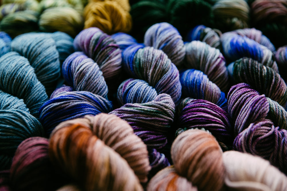
La couleur est ce qui donne au design kawaii son onirisme caractéristique. La bonne palette peut faire en sorte qu'un personnage ressemble à un nuage de guimauve ; la mauvaise peut le rendre froid ou dur. Voici comment créer des palettes qui chantent, même si la théorie des couleurs n'a jamais été votre fort.
Commencer par les familles pastel
Les pastels sont le cœur de la couleur kawaii. Les roses doux, les bleus bébé, les verts menthe, la lavande, le jaune beurre et le pêche sont les suspects habituels. Ces couleurs à faible saturation et haute luminosité sont douces et joyeuses. En cas de doute, optez pour un pastel. Cela ne manque presque jamais dans le design kawaii et cela s'accorde sans effort avec les formes arrondies et douces dont nous avons parlé plus haut.
Ceci dit, le kawaii n'est pas uniquement pastel. Les tons « dessert » atténués, crème, caramel, brun doux et rose poudré, fonctionnent également à merveille et ajoutent une chaleur douillette, comme celle d'un biscuit. Et ne négligez pas les couleurs vives « bonbon » utilisées avec parcimonie. Une touche de rose vif ou de bleu ciel sur une palette autrement pastel crée un contraste délicieux qui empêche le design de paraître délavé. L'astuce est de laisser le pastel faire le gros du travail et de laisser le vif agir comme une étincelle.
La règle des 60-30-10 pour la cohésion
Un moyen simple de conserver la cohésion de votre palette est la règle 60-30-10, empruntée à la décoration intérieure. Environ 60 % de votre amigurumi doit être d'une couleur dominante, souvent un neutre comme le crème ou un pastel principal. Environ 30 % doit être une couleur secondaire, un pastel complémentaire. Et environ 10 % doit être un accent, une touche de couleur vive ou un détail contrastant comme un nœud ou un fard à joues. Cela crée une harmonie visuelle et maintient l'œil à l'aise plutôt que submergé.
Par exemple, un lapin kawaii pourrait être à 60 % crème pour le corps, à 30 % rose doux pour l'intérieur des oreilles et les pieds, et à 10 % corail pour un petit nœud et un fard à joues. Le résultat semble intentionnel et soigné plutôt que coloré au hasard. Une fois que vous aurez utilisé cette règle quelques fois, vous commencerez à l'appliquer instinctivement à chaque projet.
Créer un tableau d'ambiance
Avant de commencer, rassemblez de l'inspiration. Enregistrez des images de personnages kawaii, d'emballages de bonbons, de papeterie et de scènes de nature qui partagent l'émotion que vous recherchez. Cherchez les couleurs communes et remarquez comment elles se rapportent. Un tableau d'ambiance élimine les incertitudes du choix des couleurs et entraîne votre œil au fil du temps. De nombreux créateurs conservent un tableau Pinterest dédié ou un dossier de captures d'écran spécifiquement pour l'inspiration des couleurs kawaii, et ils y retournent chaque fois qu'ils commencent un nouveau design.
N'oubliez pas le contraste pour les fonctionnalités
Bien que la palette du corps doive être douce, les traits du visage ont besoin de suffisamment de contraste pour être visibles. C'est là que votre choix d'yeux compte énormément. Sur un visage pastel pâle, les yeux de sécurité noirs classiques offrent le contraste qui fait ressortir l'expression et donne au personnage un point focal. Sur un visage plus foncé ou plus saturé, vous pourriez vouloir des yeux de sécurité colorés avec un iris clair, ou même un support en feutre contrastant derrière l'œil. Nous parlerons plus en détail des yeux dans un instant, mais gardez le contraste à l'esprit dès la première maille.
Le secret de la mignonnerie : le placement des yeux dans l'amigurumi kawaii
S'il y a une compétence qui définit l'excellent amigurumi kawaii, c'est bien le placement des yeux. Vous pouvez avoir des proportions parfaites et une palette onirique, mais si les yeux sont au mauvais endroit, tout le personnage tombe à plat. Voici ce que vous devez savoir pour réussir à chaque fois.
Quelle doit être la distance entre les yeux ?
Comme règle de départ, placez les yeux kawaii à environ une à deux largeurs d'œil d'intervalle, mesurées de centre à centre. Un espacement plus large donne une impression de jeunesse, d'innocence et de « bébé », ce qui est exactement le point fort du kawaii. Un espacement plus serré peut donner une impression de maturité ou, si trop rapproché, de strabisme et de maladresse. Pour la plupart des têtes kawaii, une bonne formule consiste à compter vos mailles du dernier rang, à trouver le centre et à placer les yeux à environ quatre à sept mailles d'intervalle, selon la taille de la tête.
Tenez toujours les yeux en place et reculez avant de vous engager. L'appareil photo de votre téléphone est votre meilleur ami pour repérer les problèmes de placement, car il aplatit la forme tridimensionnelle et montre la proportion telle que les autres la verront. Prenez une photo, regardez-la en petit, et faites confiance à ce que vous voyez. Si quelque chose vous semble bizarre sur la photo, ce sera également bizarre en personne.
La règle « Plus haut, c'est plus jeune »
Les yeux placés plus haut sur le visage donnent une impression de jeunesse, de vulnérabilité et de mignonnerie. Les yeux placés plus bas donnent une impression de vieillesse, de sagesse ou de bouderie. Pour un effet kawaii maximal, placez les yeux dans le tiers supérieur du visage, juste au-dessus de l'endroit où le museau ou le nez se trouverait. Cet ajustement unique, déplacer les yeux d'une ou deux mailles vers le haut, produit un énorme changement vers « adorable » et est l'astuce la plus sous-utilisée dans le design kawaii amateur.
Combinez cela avec un espacement large et vous obtiendrez le look classique de bébé animal qui définit le genre. Combinez-le avec un espacement légèrement plus serré et vous obtiendrez un personnage kawaii plus « ado », comme une écolière chibi ou un chat nonchalant. La position verticale est un cadran que vous pouvez tourner pour changer l'âge et l'humeur de votre personnage avec une précision surprenante.
Choisir les bons yeux pour le Kawaii
Les personnages kawaii bénéficient presque toujours de grands yeux. Alors qu'un animal réaliste pourrait utiliser des yeux de 6 mm ou 9 mm, les designs kawaii brillent souvent avec des yeux de 12 mm ou même 15 mm qui créent ce grand regard expressif inspiré des animes. Plus l'œil est grand par rapport à la tête, plus le personnage est « kawaii », jusqu'à un point où les yeux commencent à dominer tout le visage, ce qui peut être un choix délibéré et charmant pour les petites breloques.
Pour le kawaii spécifiquement, notre collection d'yeux de sécurité kawaii offre des tailles et des styles conçus exactement pour cette esthétique, y compris des options avec des paillettes et des iris surdimensionnés qui maximisent la mignonnerie. Associez-les à une petite bouche brodée et une touche de fard à joues rose, et vous obtiendrez un kawaii instantané sans aucune technique avancée. Les yeux font le gros du travail.
Symétrie et l'astuce du compte des mailles
La symétrie est non négociable dans le design kawaii. Un visage asymétrique est perçu comme « cassé » plutôt que « mignon », et les spectateurs remarquent l'asymétrie même s'ils ne peuvent pas la nommer. Comptez toujours les mailles entre les yeux et de chaque œil au centre du visage. Marquez le placement avec des marqueurs de mailles amovibles avant d'insérer les yeux, et vérifiez que les deux yeux sont à la même hauteur. Si vous êtes entre deux tailles, optez pour une taille légèrement plus grande pour le kawaii ; si vous avez besoin de réalisme, optez pour une taille plus petite. Gardez un petit carnet de vos « formules d'yeux » préférées pour différentes tailles de tête afin de pouvoir reproduire vos succès.
Joues, bouches et petits détails qui font le « Kawaii »
Une fois les yeux placés, quelques petits détails transforment votre personnage de « sympa » à « irrésistible ». Ce sont les touches finales qui séparent un jouet compétent d'un personnage que les gens veulent serrer dans leurs bras.
Joues Rougies
Un petit cercle rose sur chaque joue est le détail kawaii le plus efficace que vous puissiez ajouter. Vous pouvez le broder avec du fil rose, tamponner un peu de peinture rose sans danger pour le tissu, ou utiliser un petit point de fil rose. Les joues signalent la santé, la jeunesse et le bonheur, et elles amplifient instantanément la mignonnerie. Placez-les juste en dessous et légèrement à l'extérieur des yeux, et gardez-les petites. Une joue trop grande donne un air clownesque plutôt que mignon, donc la retenue est essentielle.
La bouche
Les bouches kawaii sont minuscules et simples. Un petit « w » ou une « bouche de chat » comme un « 3 » horizontal, un petit « o » pour la surprise, ou une légère courbe pour un sourire sont tout ce dont vous avez besoin. Gardez-la petite et centrée sous les yeux. Une bouche trop grande domine le visage et tue l'ambiance kawaii, car les yeux doivent rester le point focal. Pratiquez quelques styles de bouche sur des chutes de fil avant de vous engager sur le placement final.
Accents optionnels
De petits accents comme un petit nœud, une fleur, une étoile ou un petit chapeau ajoutent de la personnalité sans surcharger. La clé est la retenue : un accent, placé avec soin, est préférable à trois accents qui se concurrencent. Choisissez un accent qui complète votre palette de couleurs plutôt que de la combattre, et assurez-vous qu'il ne couvre pas les yeux ou la bouche. Un nœud légèrement sur le côté, une fleur nichée derrière une oreille, ou une petite étoile flottant au-dessus de la tête sont tous des classiques du kawaii.
D'animal réel à Kawaii : une méthode de transformation
L'un des exercices les plus amusants du design kawaii consiste à prendre une référence réaliste et à la « kawaïfier ». Voici une méthode reproductible que vous pouvez utiliser sur presque n'importe quel animal ou objet.
Étape 1 : Exagérer la tête
Prenez votre animal de référence et agrandissez mentalement sa tête pour qu'elle corresponde au moins à son corps. Si l'animal réel a une petite tête, comme un cheval ou une girafe, ce seul changement fait la majeure partie du travail de mignonnerie. Ne vous souciez pas de la précision biologique ; le kawaii est une question de sensation, pas de faits. Une girafe à grosse tête est infiniment plus câline qu'une girafe fidèle.
Étape 2 : Adoucir chaque bord
Arrondissez le museau, adoucissez les oreilles et repulpez le corps. Remplacez les angles vifs par des courbes. Un renard kawaii a des oreilles arrondies et une queue trapue, pas les lignes élancées d'un vrai renard. Un cactus kawaii a des palettes arrondies et un petit visage souriant, pas des épines menaçantes. Examinez chaque caractéristique pointue et demandez comment vous pourriez l'adoucir tout en la gardant reconnaissable.
Étape 3 : Simplifier le visage
Réduisez le visage à deux yeux, éventuellement un petit nez et une petite bouche. Laissez tomber les marques réalistes à moins qu'elles ne soient iconiques, comme les taches d'un panda, et même dans ce cas, simplifiez-les en formes épurées. L'objectif est une lisibilité instantanée : un spectateur doit savoir ce qu'est votre personnage en une seconde, et la simplicité est ce qui offre cette rapidité.
Étape 4 : Pasteliser la palette
Faites passer les couleurs naturelles vers les pastels. Un ours brun devient un ours caramel ou crème ; un chat gris devient un lavande doux ou un gris-bleu. Ce léger changement de couleur amplifie la lecture douce et amicale et lie le personnage à la famille kawaii. Gardez à l'esprit votre règle des 60-30-10 afin que la version pastel reste cohérente plutôt que boueuse.
Pas à pas : Concevoir votre premier personnage Kawaii
Prêt à essayer ? Voici un processus simple que vous pouvez suivre pour tout design kawaii, d'un lapin blob à une petite étoile.
- Choisissez un animal ou un objet de base. Commencez simple : un lapin rond, une étoile, un nuage ou un petit ours. Plus la silhouette est simple, plus l'effet kawaii est facile.
- Esquissez les proportions chibi. Dessinez une énorme tête et un tout petit corps. Notez où iront les yeux, les joues et la bouche sur votre croquis.
- Choisissez votre palette en utilisant le 60-30-10. Choisissez un pastel dominant, un secondaire et un accent avant de prendre votre crochet.
- Crochetez le corps. Travaillez en rond pour des formes arrondies. Bourrez fermement mais pas trop serré pour que la forme reste lisse.
- Placez les yeux hauts et larges. Utilisez la méthode de comptage des mailles et vérifiez votre placement avec une photo avant d'insérer les rondelles.
- Ajoutez les joues, la bouche et un accent. Gardez les détails minimaux, doux et symétriques.
- Reculez et ajustez. Déplacez un œil d'une maille, décalez une joue, ajustez la bouche. Les petits changements créent un grand impact.
Erreurs courantes du Kawaii (et comment les corriger)
Même les artisans expérimentés trébuchent. Voici les pièges kawaii les plus courants et comment les corriger précisément dans votre prochaine création.
Erreur 1 : Proportions réalistes
Si votre personnage semble « bizarre » mais que vous ne savez pas pourquoi, vérifiez le rapport tête/corps. Un rapport réaliste de 1:3 ou 1:4 donne l'impression d'un « animal en peluche », pas d'un « kawaii ». Corrigez-le en agrandissant la tête ou en rétrécissant le corps dans votre prochaine version. En cas de doute, faites la tête plus grande que ce qui semble raisonnable ; ce sera généralement la bonne taille.
Erreur 2 : Les yeux trop bas
Les yeux bas sont le tueur kawaii le plus courant. Corrigez en déplaçant les yeux vers le tiers supérieur du visage. Vous serez étonné de la différence qu'une seule maille de hauteur peut faire. C'est l'amélioration la plus rapide et la moins chère à la disposition de tout créateur kawaii.
Erreur 3 : Trop de détails
Un visage surchargé de broderies, d'accents multiples et de motifs chargés perd la sensation calme et douce du kawaii. Modifiez sans pitié et supprimez tout ce qui n'augmente pas la mignonnerie. Si vous avez ajouté un nœud, des joues et une bouche détaillée, envisagez d'en supprimer un pour restaurer l'équilibre.
Erreur 4 : Contraste de couleurs trop marqué
Des couleurs vives qui jurent ou des neutres boueux peuvent nuire à l'ambiance onirique du kawaii. Tenez-vous à votre tableau d'ambiance et à la règle des 60-30-10, et votre palette restera cohérente. Si une couleur s'oppose aux autres, mettez-la de côté pour un autre projet.
Amigurumi Kawaii pour différents niveaux de compétence
L'une des belles choses du design kawaii est qu'il s'adapte à votre niveau de compétence. Les débutants peuvent faire une boule ronde avec deux yeux et l'appeler une créature ; les artisans avancés peuvent construire des dragons kawaii élaborés avec des ailes articulées. Voici comment l'aborder à chaque niveau.
Les débutants devraient commencer par des formes à une seule boule ou des formes simples à deux parties. Une tête ronde avec un petit corps, deux yeux de sécurité et une bouche brodée constitue un personnage kawaii complet. Concentrez-vous sur une tension uniforme et un rembourrage ferme et sans grumeaux. La mignonnerie vient de la proportion et du placement des yeux, pas de la complexité.
Les intermédiaires peuvent ajouter des changements de couleur, de la broderie simple et de petits accessoires comme des nœuds ou de minuscules oreilles. C'est ici que la palette 60-30-10 commence vraiment à briller, et où vous pouvez expérimenter avec différentes tailles d'yeux pour trouver votre style signature.
Les créateurs avancés peuvent tenter des personnages kawaii complexes avec plusieurs parties, des armatures en fil de fer pour la pose et des visages détaillés. Même ici, les principes tiennent : proportions chibi, formes arrondies, traits doux et yeux parfaits. La maîtrise du kawaii est une question de retenue et de précision, pas de difficulté pour la difficulté.
Où trouver des fournitures et continuer à créer
La joie de l'amigurumi kawaii est qu'il est infiniment reproductible. Une fois que vous avez maîtrisé les principes, vous pouvez les appliquer aux lapins, aux ours, aux étoiles, aux nuages, à la nourriture, et au-delà. Garder un espace de création bien approvisionné permet de concrétiser l'inspiration dès qu'elle se présente, afin de ne jamais perdre l'élan d'une bonne idée.
Sur mucunnia.com, nous expédions partout dans le monde, donc peu importe où vous créez, vous pouvez garder votre atelier approvisionné en yeux de sécurité, marqueurs de mailles et accessoires qui rendent la magie kawaii possible. Commencez avec quelques tailles d'yeux adaptés au kawaii, constituez votre stock de fil pastel et laissez libre cours à votre imagination. Les bonnes fournitures éliminent les frictions et permettent au design de s'exprimer.
Conclusion : Concevoir avec le cœur
L'amigurumi kawaii consiste finalement à communiquer la chaleur et le bonheur à travers la forme, la couleur et ces yeux si importants. En appliquant des proportions chibi, des silhouettes arrondies, des palettes de couleurs pastel douces et un placement des yeux haut et large, vous créerez des personnages qui ne sont pas seulement mignons à regarder, ils sont mignons à ressentir. Et ce sentiment est ce qui incite les créateurs, et les personnes à qui ils offrent leurs créations, à en redemander.
Alors, prenez votre crochet, choisissez un pastel et commencez à expérimenter. Le monde a besoin de plus de kawaii, et votre prochain petit ami n'attend que de naître. Que vous les gardiez, les offriez ou les vendiez, chacun d'eux porte un morceau de la joie que vous avez ressentie en le fabriquant. Bon crochet !


